Apr 21st, 2026
Custom Product Labels: A Complete Guide to Building Brand Recognition
Walk down any retail aisle — physical or digital — and you'll notice something immediately: the brands you recognize, you recognize because of how they look.
The color, the typeface, the finish on the label. Brand recognition is rarely the result of a single campaign. It's built through thousands of small, consistent visual impressions over time.
Your product label is one of the most powerful tools you have for creating those impressions. Done well, it does three things simultaneously: communicates what the product is, establishes your brand identity, and influences a purchase decision — all in a matter of seconds.
This guide walks through the key elements of effective custom product labels and how to use them to build real brand recognition.
Start with a Clear Brand Identity
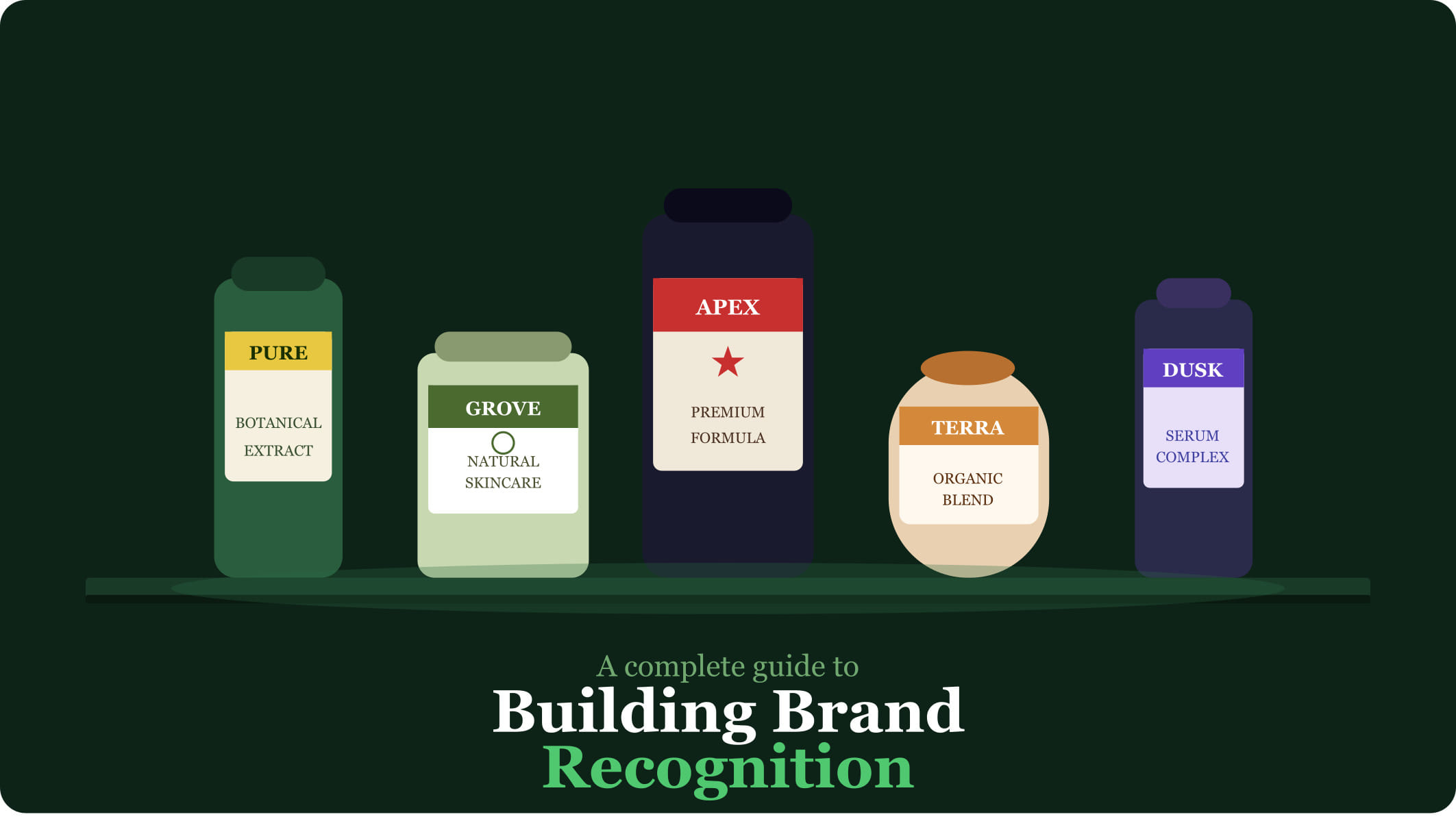
Before you design a single label, you need clarity on your brand identity. This means defining your brand's visual language: your primary and secondary colors, your typography system, your logo usage rules, and the overall aesthetic — whether that's clean and minimal, bold and expressive, heritage-inspired, or tech-forward.
Why does this matter for labels specifically? Because consistency across product lines is what creates recognition. If your shampoo label looks nothing like your conditioner label, you're missing an opportunity to build cumulative brand awareness. Customers who love one product should be able to spot your other products immediately.
Design for the Shelf, Not Just the Screen
One of the most common mistakes in label design is optimizing for how a label looks on a computer screen rather than how it looks in context — on a shelf, next to competitors, at arm's length.
A few practical design principles that translate well to physical labels:
Use high contrast between background and text so the product name is instantly readable.
Keep your most important information in the top third of the label — that's what's visible in many retail display formats.
Consider the shape of your packaging. A cylindrical bottle calls for wrap-around label design; a flat pouch needs a different approach.
Test your label design printed and applied to the actual packaging before ordering a full run.
Choose the Right Finish to Match Your Brand Position
The finish of your label — gloss, matte, soft-touch, foil — communicates as much as the design itself. A gloss finish reads as bright, energetic, and mass-market. A matte finish reads as refined, thoughtful, and premium. A soft-touch laminate signals luxury.
There's no universally right answer, but there should be a deliberate answer — one that aligns with where your brand sits in the market and what your target customer expects.
Include What Customers and Regulators Need to See
Beyond brand identity, labels serve a functional purpose: they communicate essential information. Depending on your industry, this might include ingredient lists, nutritional information, usage instructions, safety warnings, country of origin, barcode, and QR codes.
The challenge is balancing information density with visual clarity. Brands that handle this well typically use a tiered hierarchy: the front label for brand identity and key selling messages, and the back or side label for regulatory and informational content.
Invest in Consistency Across Your Product Line
As your product range grows, label consistency becomes increasingly important. Every time a customer sees a new product from your brand and immediately recognizes it as yours, you've built a bit more brand equity.
This means standardizing your label template — consistent logo placement, consistent color palette usage, consistent font choices — while allowing enough flexibility to differentiate between product variants (different flavors, scents, sizes, or categories).
Cover Label specializes in custom labels that bring brand identities to life — from concept to full production runs. Whether you're launching a new product or refreshing an existing line, our team can help you create labels that build recognition from day one. Learn more at coverlabel.com.
CONTACT US
Get in Touch
Have questions or ready to get started? Our team is here to provide expert guidance and premium label solutions tailored to your needs. Fill out the form below, and we’ll be in touch shortly to discuss your project.