Apr 21st, 2026
5 Common Label Printing Mistakes That Undermine Your Product (and How to Fix Them)
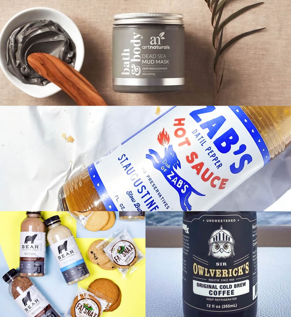
A great product with a poor label is still at a disadvantage. Labels that peel, colors that don't match your brand, or text that's difficult to read can undermine customer confidence and cost you sales — often without you ever knowing why.
The good news is that most label problems are entirely preventable. Here are the five most common label printing mistakes and, more importantly, how to avoid each of them.
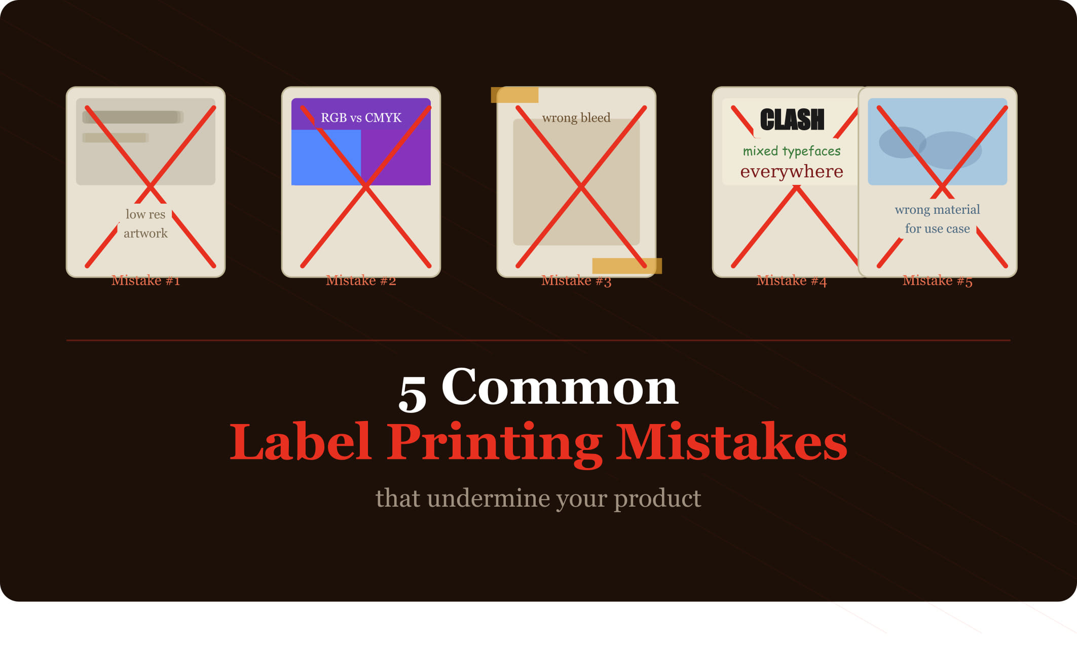
Mistake #1: Choosing the Wrong Material for the Application
This is the most costly mistake on this list, because it's only fully apparent after you've already received — and potentially applied — your labels.
Paper labels placed on refrigerated bottles will bubble and peel. Standard vinyl used in chemical environments can deteriorate rapidly. Labels applied to flexible packaging that's frequently squeezed or rolled will crack if the material isn't rated for those conditions.
The fix: Before specifying a material, document exactly where and how the label will be used. Will it encounter moisture, heat, freezing temperatures, UV exposure, or chemicals? Share that information with your label supplier and let them recommend the appropriate material — or request test samples before committing to a full run.
Mistake #2: Designing in RGB Instead of CMYK
Digital screens display color using RGB (red, green, blue) — an additive color model that's capable of producing colors that simply can't be replicated in print. If your designer builds your label artwork in RGB and it's printed using CMYK (the standard for physical printing), colors will shift — often significantly.
Vibrant blues often become dull purples. Certain greens take on a muddy appearance. Colors that looked stunning on screen print as flat and disappointing.
The fix: Ensure your label artwork is built and delivered in CMYK color mode, and that your designer specifies Pantone (PMS) color references for any brand-critical colors that need to be consistent across print runs and applications.
Mistake #3: Submitting Low-Resolution Artwork
Label printing requires high-resolution files — typically 600 DPI (dots per inch) at the final print size. Artwork that looks sharp on screen at 72 DPI will print with visible pixelation and blurry edges when placed on a physical label.
This most commonly affects logos that have been saved from websites, stock images not purchased at high resolution, and designs built in tools not intended for print (like basic presentation software).
The fix: Work with a graphic designer who delivers print-ready files, or ensure your design software outputs files at 600 DPI minimum. Vector files (.ai, .eps, .pdf) are inherently resolution-independent and are preferred for logos and line art.
Mistake #4: Not Accounting for Label Application Conditions
Even a perfectly specified label can perform poorly if applied under the wrong conditions. Most pressure-sensitive labels need to be applied to surfaces that are clean, dry, and at room temperature. Application to cold, wet, or dusty surfaces dramatically reduces adhesion.
For automated label application using labeling machines, there's an additional consideration: the label material and liner need to be compatible with the equipment and the application speed.
The fix: Discuss your application process with your label supplier before finalizing material and adhesive specifications. For machine application, provide the equipment specifications so your supplier can confirm compatibility. For manual application, establish a standard process that ensures surfaces are clean and dry.
Mistake #5: Skipping the Physical Proof
Approving a label from a digital proof alone is a risk. Colors render differently on every monitor. The physical weight and finish of the material can't be conveyed digitally. And the way a label looks when actually applied to your specific packaging — curved, flat, flexible — is the only true test of whether the design works.
Many businesses that skip physical proofing end up discovering issues only after receiving their full order: a finish that doesn't match expectations, a color that reads differently on the actual material, or text that's harder to read than it appeared on screen.
The fix: Always request a physical proof or press proof before approving a full production run. Yes, it adds a few days to your timeline — but it's significantly less expensive than reprinting an entire order.
At Cover Label, we guide customers through every step of the label process — from material selection to artwork review to final approval — to help you avoid costly mistakes and get exactly the result you're expecting. Start your order at coverlabel.com.
CONTACT US
Get in Touch
Have questions or ready to get started? Our team is here to provide expert guidance and premium label solutions tailored to your needs. Fill out the form below, and we’ll be in touch shortly to discuss your project.